Open Studio Visits and Cross-Stage Group Crits

Some feedback from the open studio visit included potentially making a zine. this came from comments referring to the figures in my prints looking like characters that could be defined more and used in a zine setting. I quite like the idea of defining my portraits as characters, whilst they would need some fleshing out I think it makes sense, as I'm trying to depict an embodied experience in a recurring figure. I was also suggested to redirect and focus on directing a narrative.

Read more »

Random Thought # 1 - A Possible Installation?

Senses, Installations, Nature and the Elements

So today as mentioned in my Studio 2 blog I spoke about a session I had with my lecturer about phenomenon and senses and sound in particular. This reminded me of an idea that I've had floating in my head regarding a project I could potentially do, probably not this year but maybe next? As someone who is neurodivergent the idea of senses is an extreme thing, a lot of people neurodivergent and not experiance sensory overload and from my experiance also sensory euphoria. So following this line of thought I was thinking of something that sensory wise I thoroughly enjoy is thunderstorms, the sound of thunder and rain, the flashes of lightning, the sound of pitter patter raindrops and the streaks of rain down a window.

Read more »

Winter Market (current date 23/11/2023 - Winter market 04/12/2023)

For the winter market I wanted to contribute something so I decided I would try making and selling stickers for the first time. This process was very difficult as I struggle a lot with using computer programs alike adobe, but with the help of a friend i got it mostly sorted. I printed them and I'm very happy and excited about the result and I look forward to selling them. The reason I chose frogs as an idea is partially because of guilty pleasure art, i wanted to make something i like and enjoy but also kept in mind what it thought would be sellable or appealing as a sticker.

Here are some comparisons of the original illustrations next to their sticker variants. Some of the stickers look fine such as the purple dancing frog as it was quite a bright colour it didn't get changed much during printing. On the other hand 3/4 of my frogs were green and as seen here the green froggies got vey desaturated during the programming and printing process. This is a shame because I think this is due to my lack of understanding of how to edit images on programmed as if I knew how to do that I could have made sure that my sticker stayed very bright and colourful the whole way through. This is my intent for the future. Along with that there is also a lot of brush stroke marks in my stickers and this isn't as big of an issue but hopefully in the future if I make stickers again I can improve on that. Hopefully despite this my stickers will sell well and at least this process was very informative and a learning experience for me.

Life Drawing Final Sessions

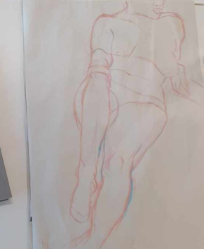
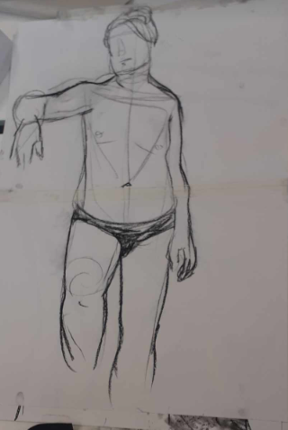
In the last couple of life drawing sessions I attended I really feel like I have learnt so much. One thing is a love for a new medium, so when I was drawing one of my friends started using the chalk we use for blackboards to draw with and I was inspired and joined in, and I don't know whether its the drawing utensil and texture or if its the addition of colour but it was amazing, fun and helped me create some of my favourite drawings I have done so far. I suspect it has something to do with the fact i have improved a lot from my first drawing sessions and am how creating drawings that are better but I also feel like using colour starting with a lighter perhaps and then a darker, creates contrast, helps me build shapes, refine lines and also use a contrast with lights and shadows, as well as adding colour to the drawing which is visually quite appealing.

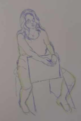
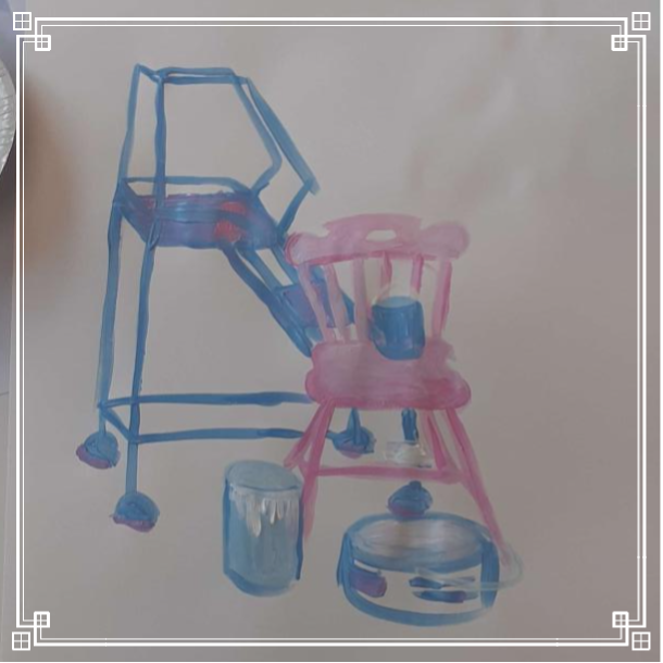
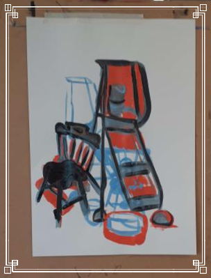
In contrast to that we also did some life painting, and this is where I really struggled. I think it was the time limit and the pressure of painting quickly but I couldn't figure out what to priorities, matching colour or getting the right shapes and proportions and it felt impossible to add any sort of details. Some advice I was given was instead of jumping to try to perfectly colour match the skin, was to use brighter colours. I still had to choose colour that I could still see but instead of trying to find the cool toned skin coloured shadow and perfectly match it, I started by juts throwing some cool purple down for example, and then I moved on to try and adding some more accurate skin tone later. Because of the time crunch I couldn't really finish colour correcting everything but i actually like how it turned out, I like the vibrant abstract colour poking through the skin and I feel it makes the piece look visually interesting. I also did a yellow and red piece as seen down below where I didn't focus on colour matching skin tones at all, I solely focused on contrast, lights and shadows and getting shapes and proportions right and i think this lifted off the pressure a lot and I love this painting. I love my use of negative space and i feel like i accurately displayed the shapes of the body and proportions very well, I think its a good example of how far I've come and how much these life drawing sessions have helped me to improve my skills.

Life Drawing - 17/11/2023

Today we did more life drawing, this time we used ink instead of charcoal. Using ink a liquid material opposed to something like charcoal made a huge difference to my drawings, they turned out so much more fluid and i think they were a lot more successful as a whole. I also think in general I am improving my overall skill in terms of technical drawings including proportions. I also think these sessions are really good for combatting perfectionism, the quick timed tasks really allow for me to not focus too much on a particular area which I think is helping me not add too many details and overcomplicating the drawing. Today one of the models was a classmate of mine and they had a formal ish shirt on during the life drawing. Usually I'm used to models being down to their underwear or in skin tight clothing which is good in its own way, but it was really fun having such a shapely bit of clothing to draw. I got a bit obsessed with all the shapes and lines and shadows and folds in the shirt and in a couple of my drawings including both of the ones here, I ended up not being able to fit parts of the body on the page because I made the shirt too big. But nevertheless I'm really enjoying the sessions and plan on going to the next three.

Life Drawing and Painting - 10/11/2023

Today I attended a life drawing session as well as a painting session. Although i did technically do life drawing in my foundation year, it was online through a screen (although i adore my results), the in person life drawing was an eye opening experiance. I really enjoyed having different amounts of time figuring out how to draw a figure and ironically my favourite one was the drawing that took me only 5 minutes (picture on the left). I think having less time to "perfect" my lines made me draw with more fluidity resulting in a less stiff final piece.

Just above are my paintings I did, these were really far outside my comfort zone because 90 percent of the time I'm painting figures or portraits but I had a lot of fun with these still life's. We didn't have access to every colour and didn't have much time so in the first painting I decided to just pick colours I loved a worked with shading and shapes best I could. I love how it turned out as it was good for warming  me up for painting and the colours and shading I think look very aesthetic. The second painting we did I have shown too images for as one was during the process (the far right painting). This one I cant tell if I like more than the final product (middle painting) or not, I love the abstract and unfinished nature of it. I was instructed to paint the objects normally t begin with which I did in blue but then I was instructed to paint the negative space of these same objects reconfigured. At first I was stumped and had no idea but as I figured it out I paid a lot more attention to the shapes of the negative space and the objects themselves. I also struggled finishing the orange and blue painting as I didn't initially liked my final layer but the addition of black really made the rest of the colours pop and added a lot of structure to the piece.

Create Your Own Website With Webador